Improving content
discovery for the History Channel app
• UI/UX Case study - 2022
Redesigned the browsing experience to reduce friction and support more intentional exploration
• Problem
Users struggle to find relevant content due to unclear organization and overwhelming layout, and lack of browsing structure.
• Research
To understand where users struggled, I analyzed surveys, reviews, and existing platform features to identify patterns in access, navigation, and content discovery.
• Feature Analysis
Feature analysis revealed that platforms emphasize personalization, recommendations, and seamless access, highlighting gaps in discovery in the current platform.
.png)
• Surveys
Surveys showed that users subscribe for content they can easily find, not for the platform itself.
Access
70%
don't have cable
Evaluation Factors
80%
say quality of content motivates subscription
75%
want new content on the homepage
Entry Motivation
100%
are more likely to subscribe with a free trial
Personalization
60%
prioritize personaliation
• Reviews
According to existing reviews, users liked the content, but struggled with navigation, cable-only access, and too many ads, which blocked engagement.
Too many ads!
I feel like I'm watching more ads than content, even with a subscription.
I don't have cable
I haven’t subscribed to a cable provider since 2009. This is why I don’t watch History Channel shows.
Difficult navigation
I have to work harder than I’d expect to find what I want to watch in this app.
Fact or fiction?
It’s hard to identify programs that are actually historical. I’d like to see less reality TV
• Key insights
01
Vague categories and generic thumbnails caused users to default to search.
02
Discovery drives subscription. Users chose to subscribe when they could quickly find relevant, high-quality content.
03
Users couldn’t distinguish historical vs reality content, making it harder to trust what they were watching.
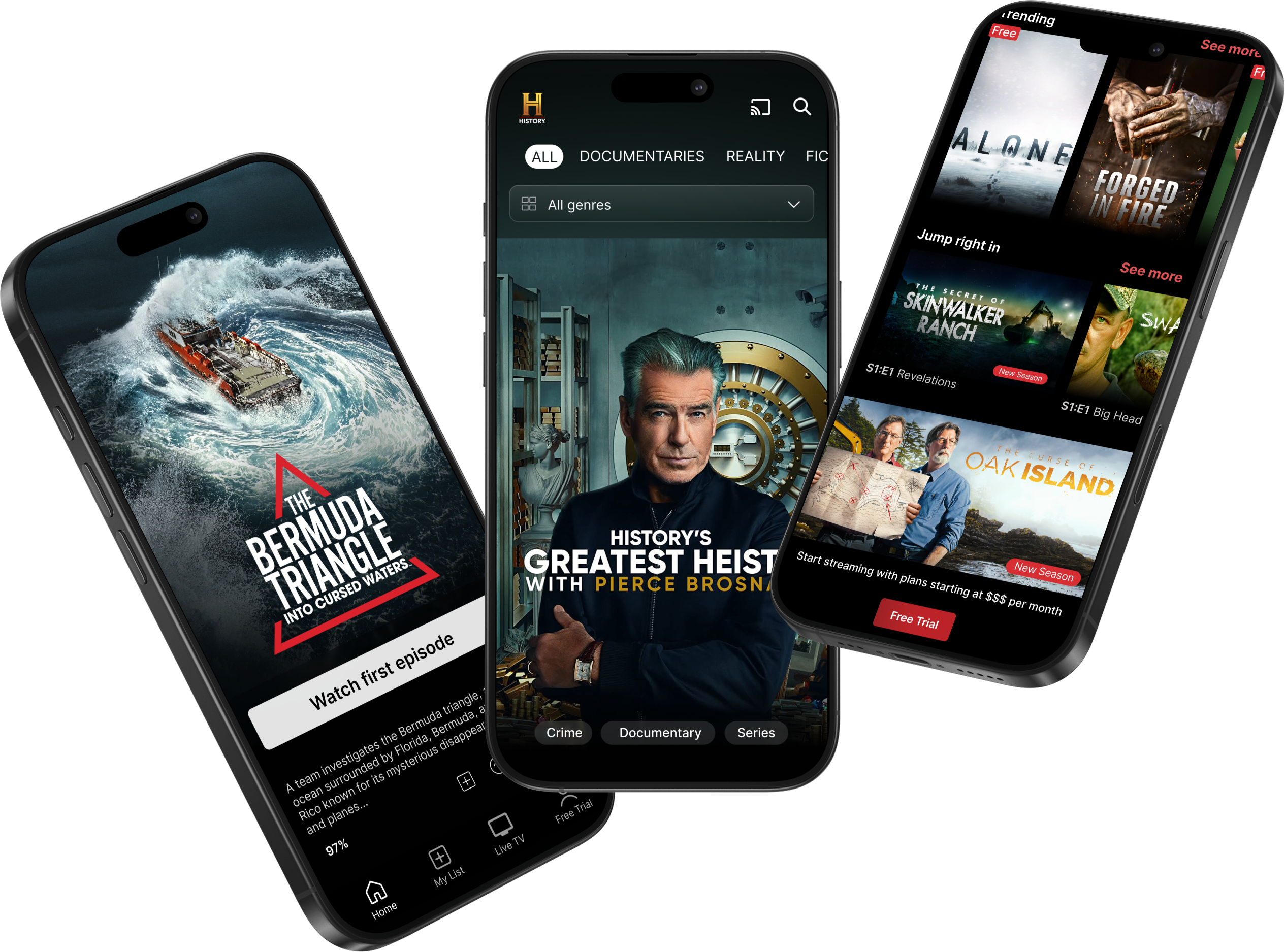
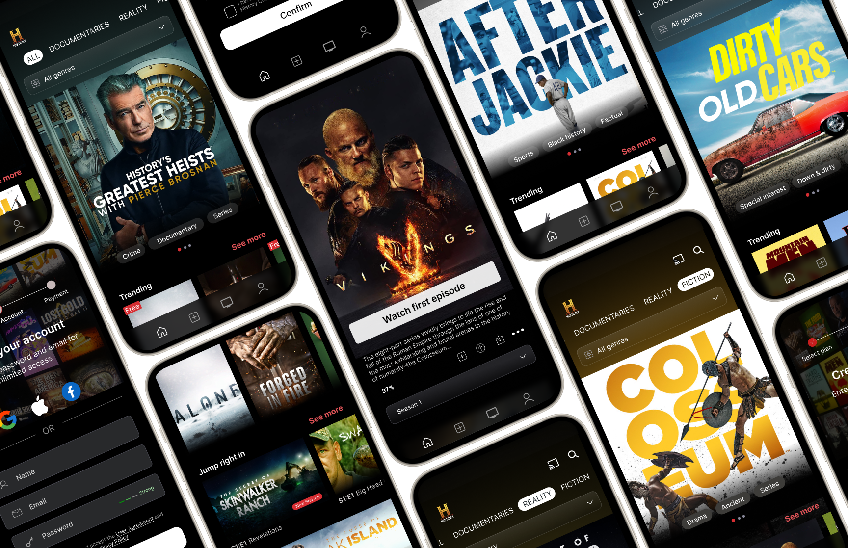
• Prototypes
Based on these insights, I explored how structured navigation and filtering could reduce browsing friction and support faster content discovery.
• Guided Content Discovery

• Sharing Content

• Free Trial Onboarding


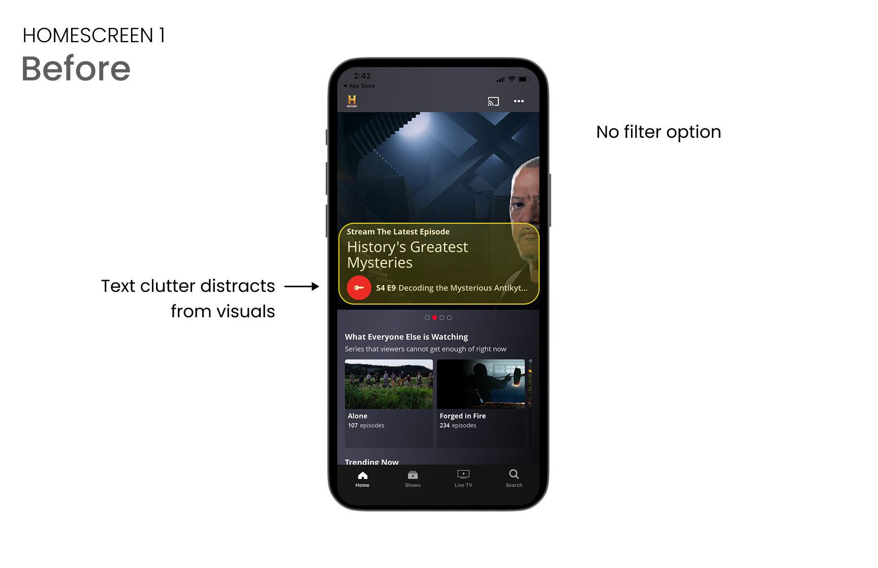
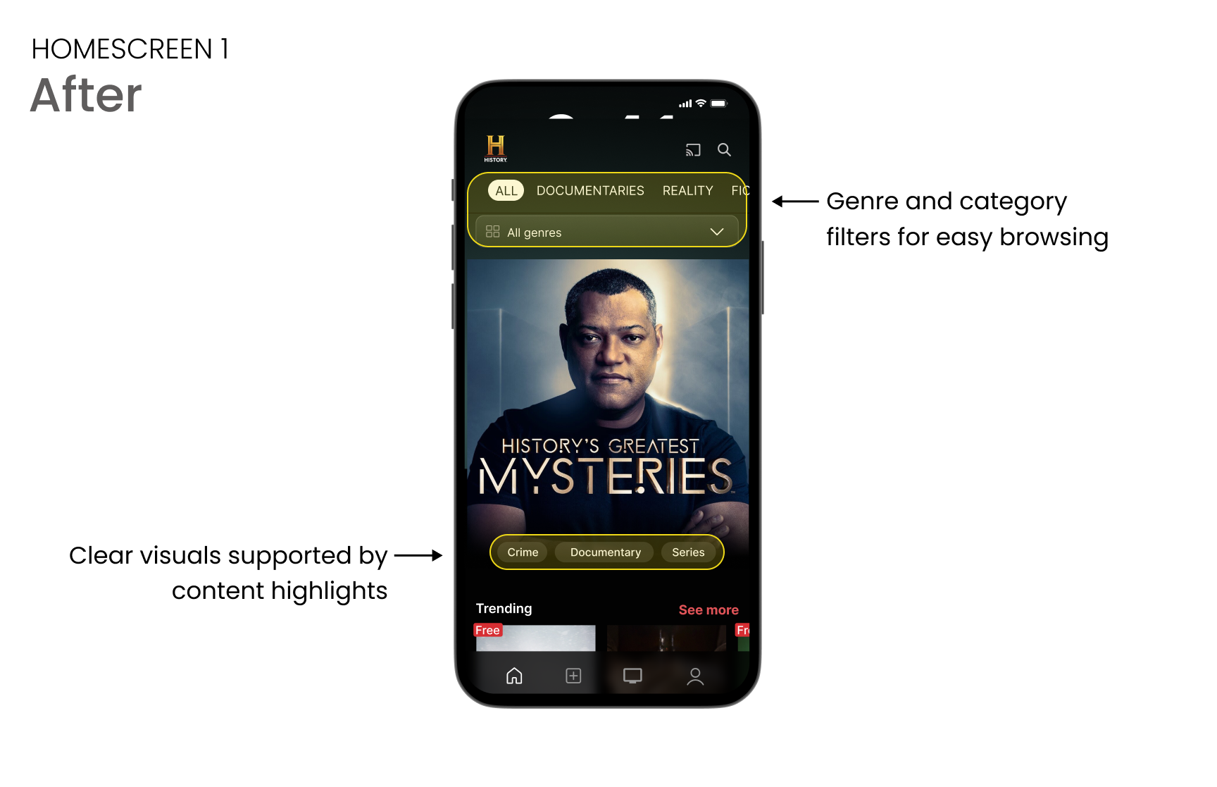
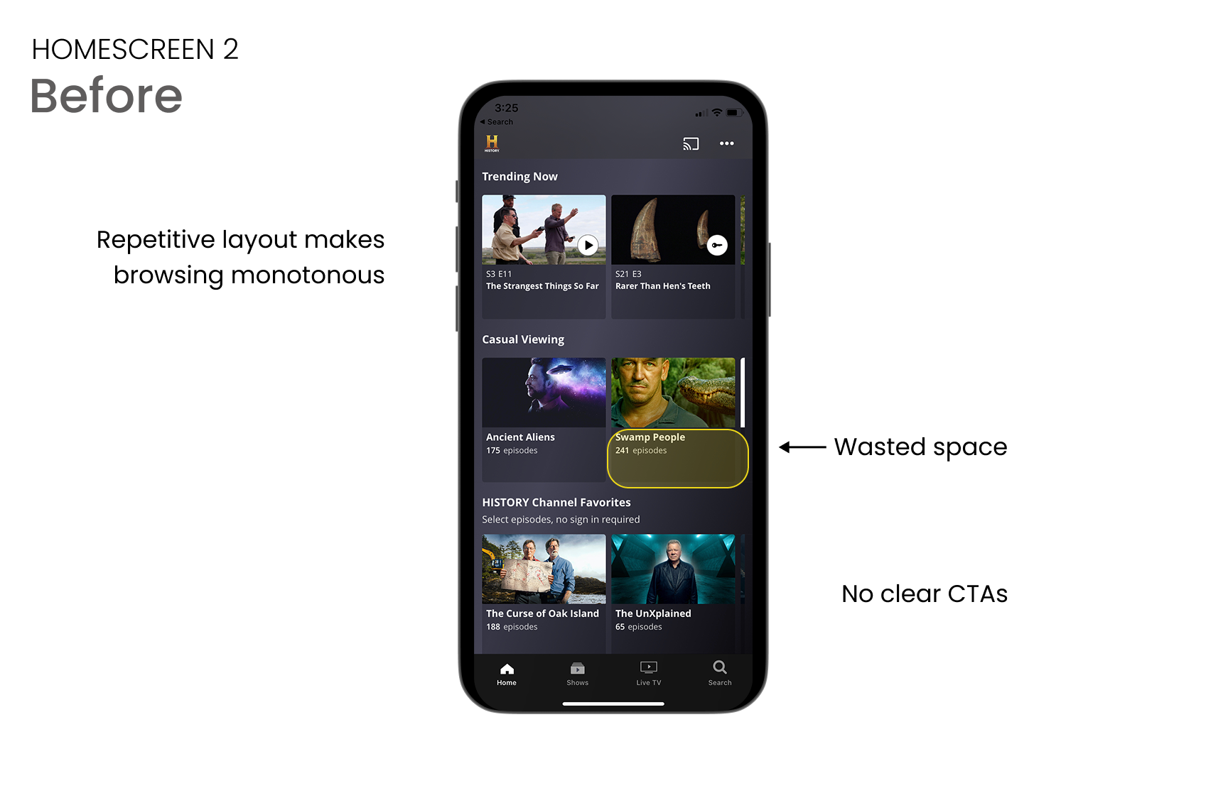
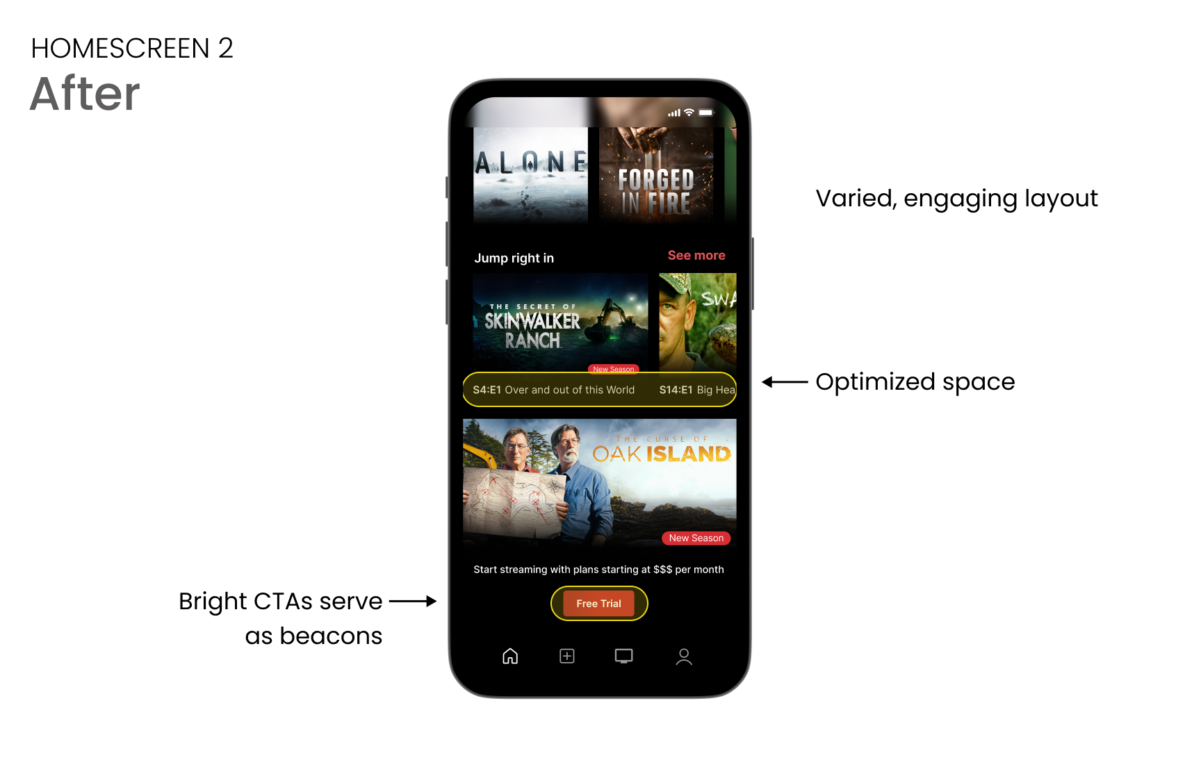
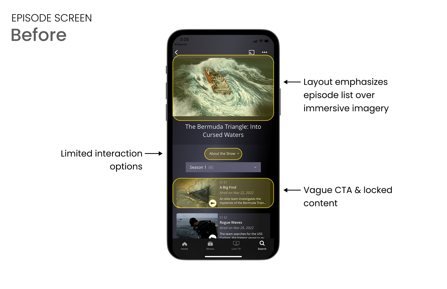
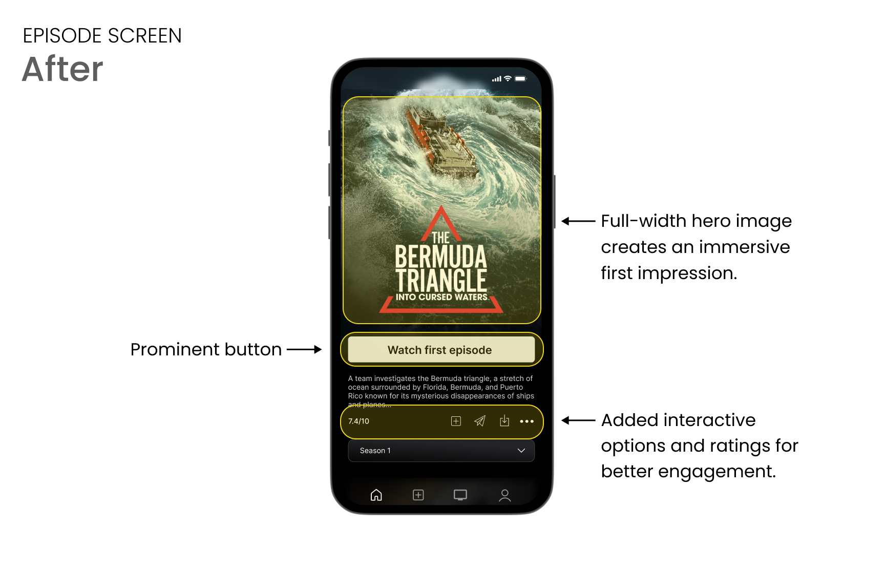
• Before & After
The original experience relied on dense layouts and unclear navigation. The redesign introduces clear structure and hierarchy, making browsing more intuitive and intentional.
• Impact
Redesigned the browsing experience to improve clarity and momentum, highlighting top-rated content and introducing strategic CTAs that support subscription conversion and sustained engagement.