A History Channel redesign focused on content discovery.
Problem
Real users had already described the problem in app store reviews: finding something to watch took too much work.
Discover
During research, reviews were the lead source, but surveys and audits became confirmation.
Three complaints kept repeating. Users liked the shows; they were frustrated by the work it took to find them, the ad load, and the cable wall.
"I feel like I'm watching more ads than content, even with a subscription."
"I haven't had cable since 2009. This is why I don't watch History Channel shows."
"I have to work harder than I'd expect to find what I want to watch."
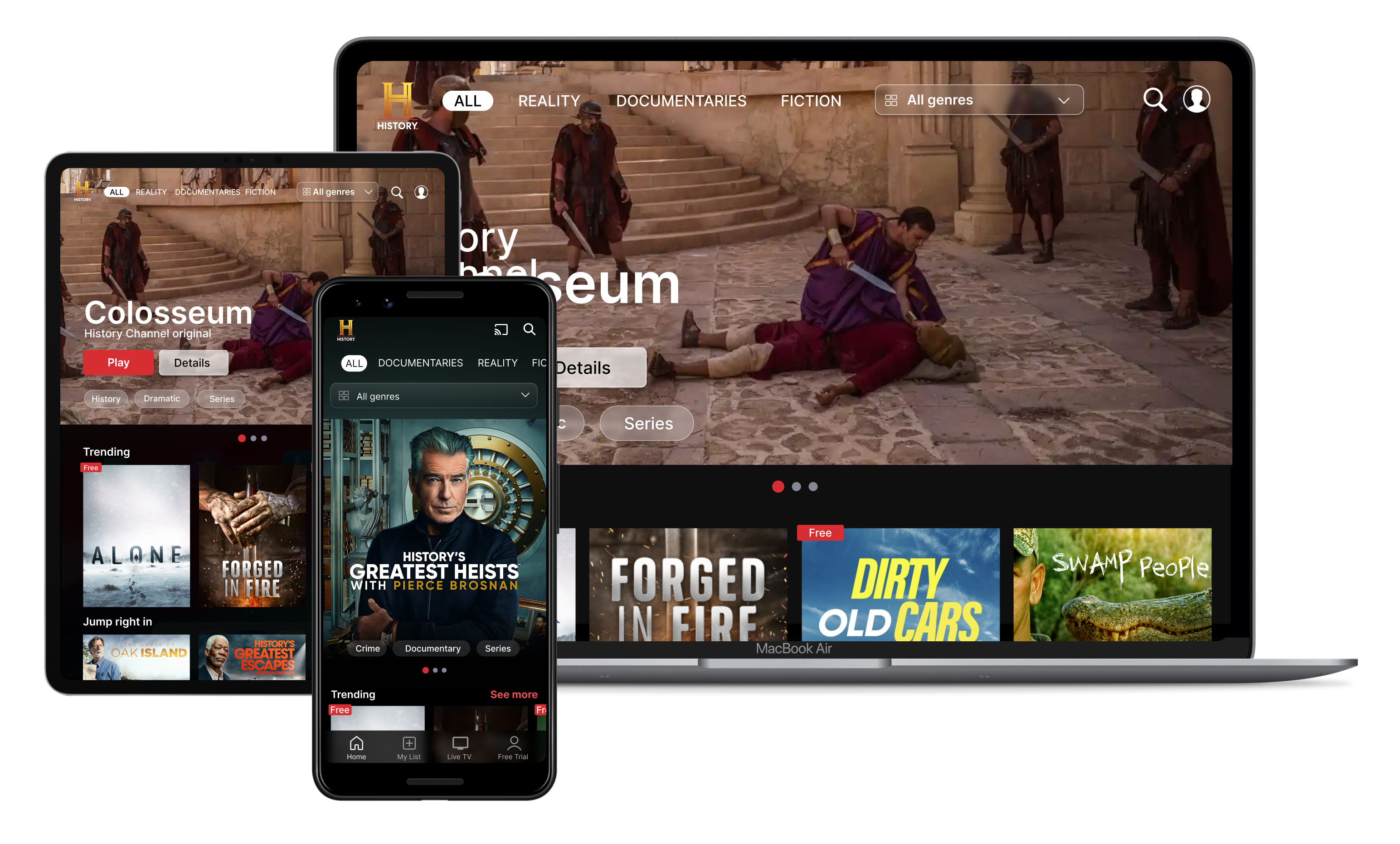
An audit of five streaming platforms showed what users have come to expect: watch-later queues, personalized rows, recommendations. The History Channel app had none of them, which explains why navigation felt like work.
Surveys backed up the reviews: viewers subscribed when they could find something worth watching, not out of brand loyalty.
Key Insights
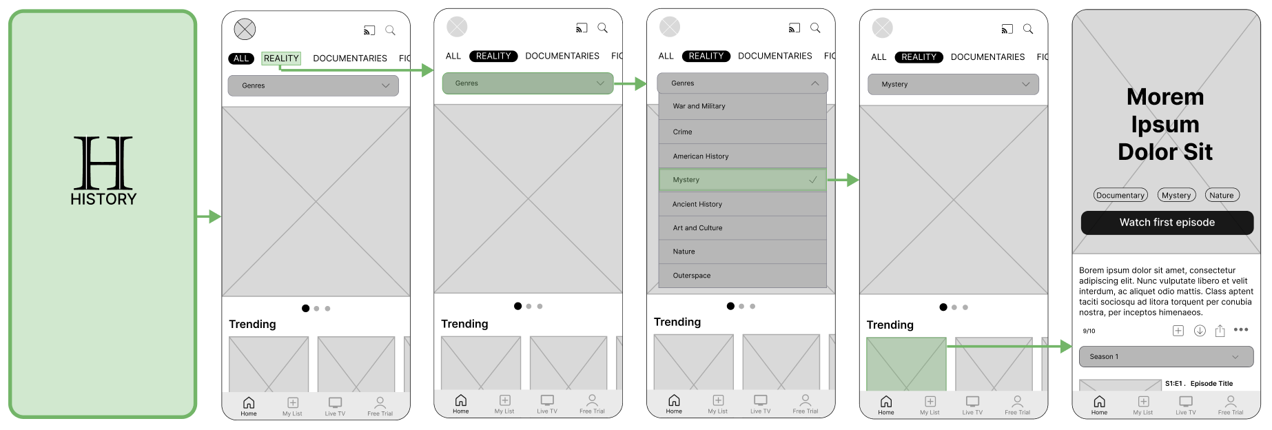
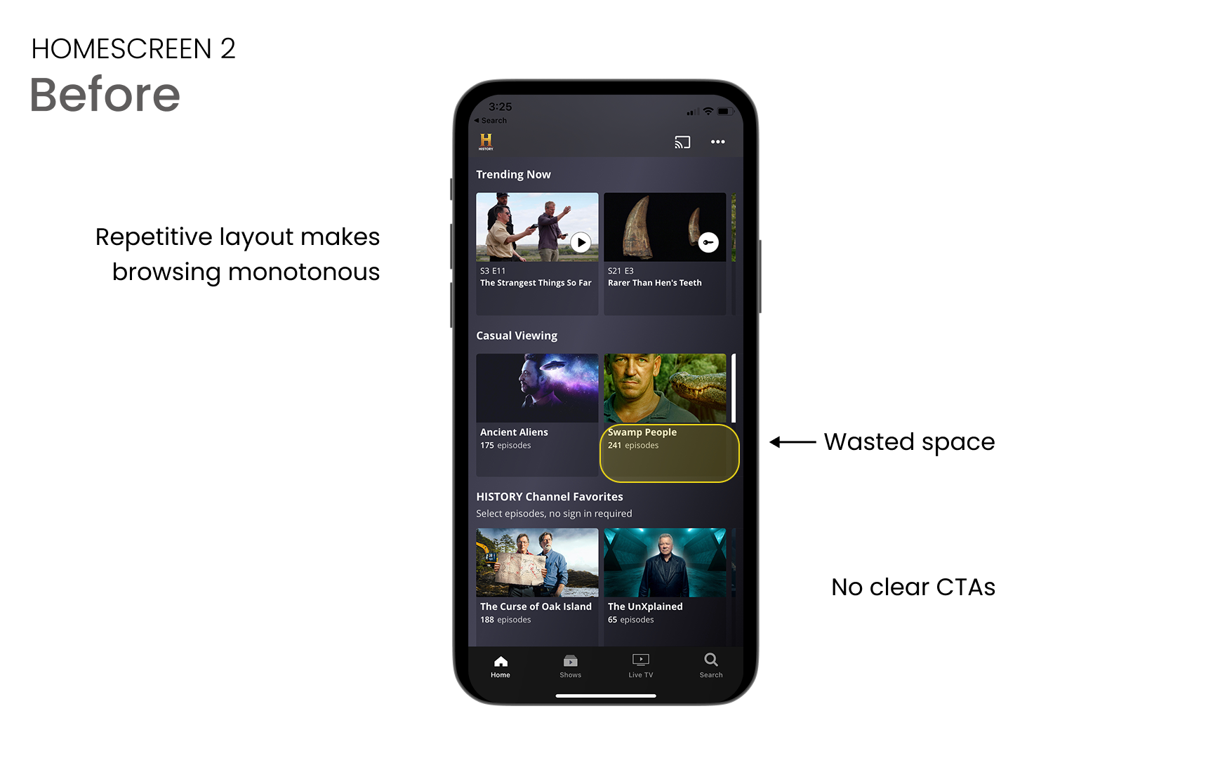
Vague categories and look-alike thumbnails pushed viewers to the search bar. Fixing navigation meant fixing the category structure first.
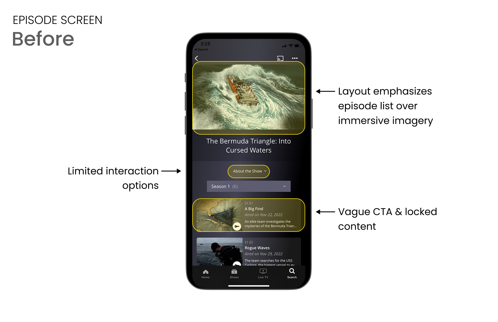
Viewers couldn't tell scripted reality from historical programming at a glance, and that ambiguity cost trust.
Commitment happens when someone finds something worth watching, not at the paywall. The homepage is the most important surface in the app.
What this drove
Each complaint became a scope decision: navigation pointed to category structure and browse rows, the labeling confusion meant clearer tagging, and the conversion insight moved the trial CTA to the moment of decision.
Iterate
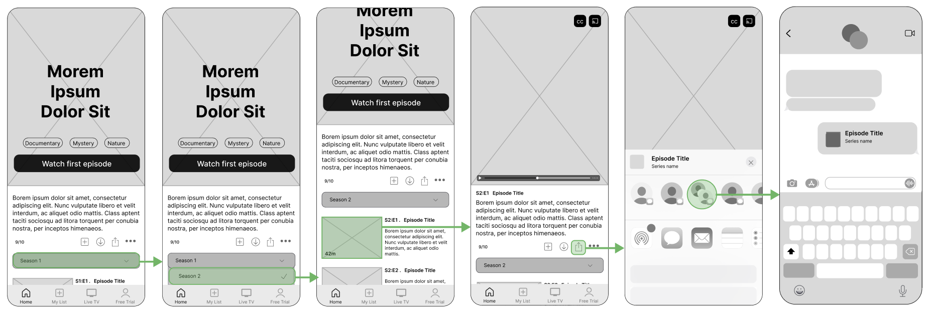
Prototypes
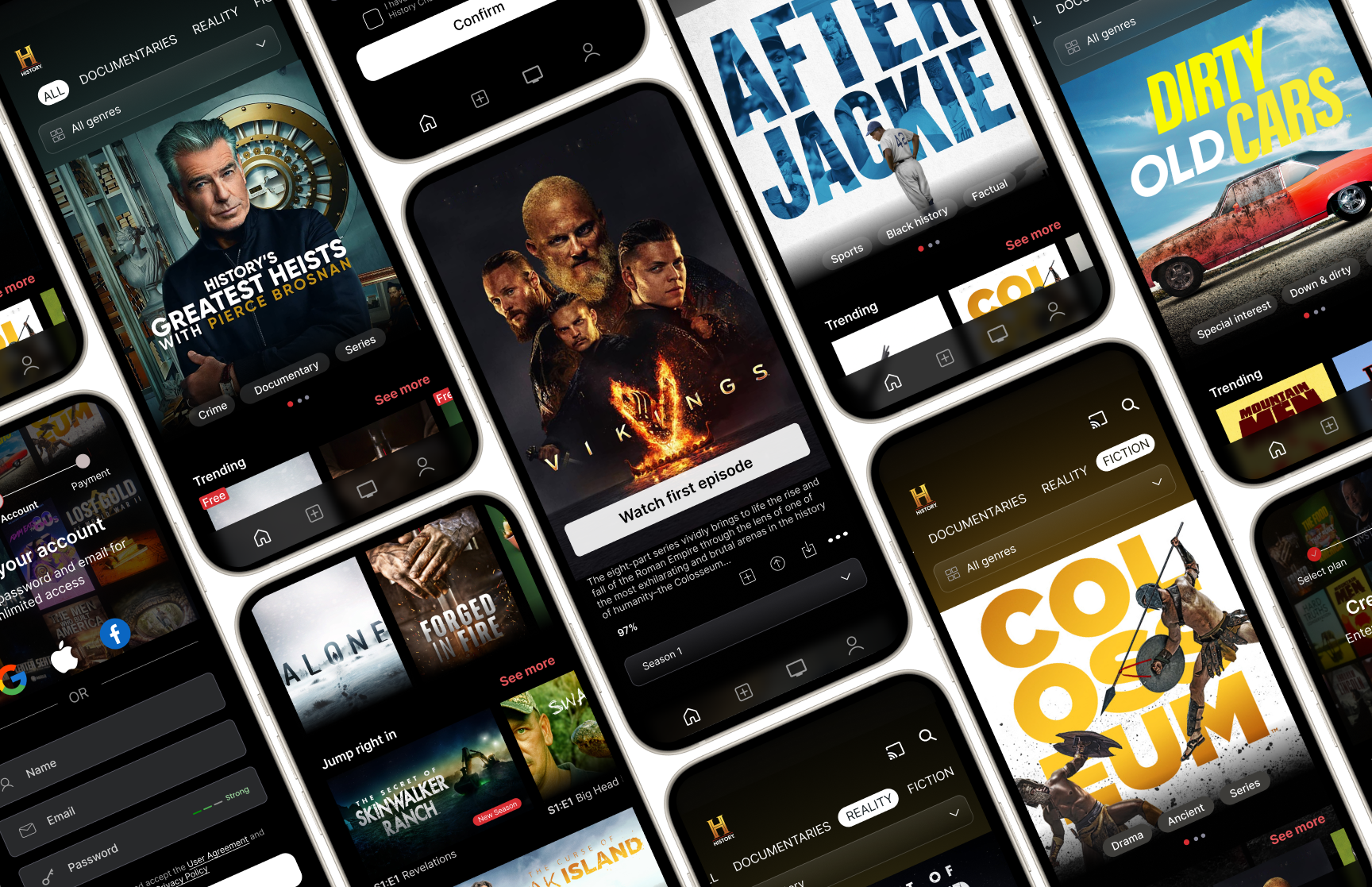
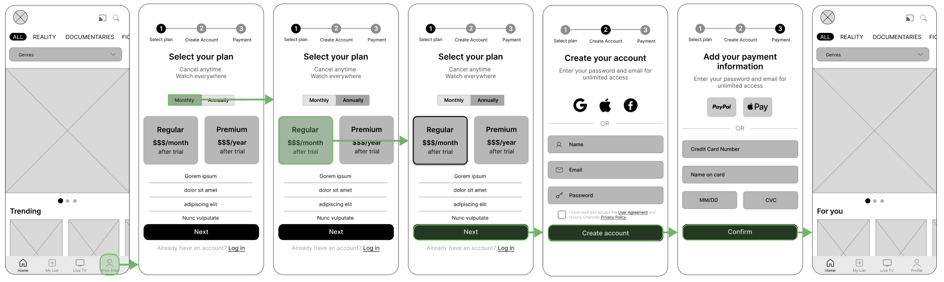
With the insights in hand, I prototyped three viewer moments: how people browse, how they sign up, and how they share what they're watching. Each flow got structured categories, meaningful filters, and fewer dead ends.
• Content discovery
• Free trial onboarding
• Sharing content
Iterate
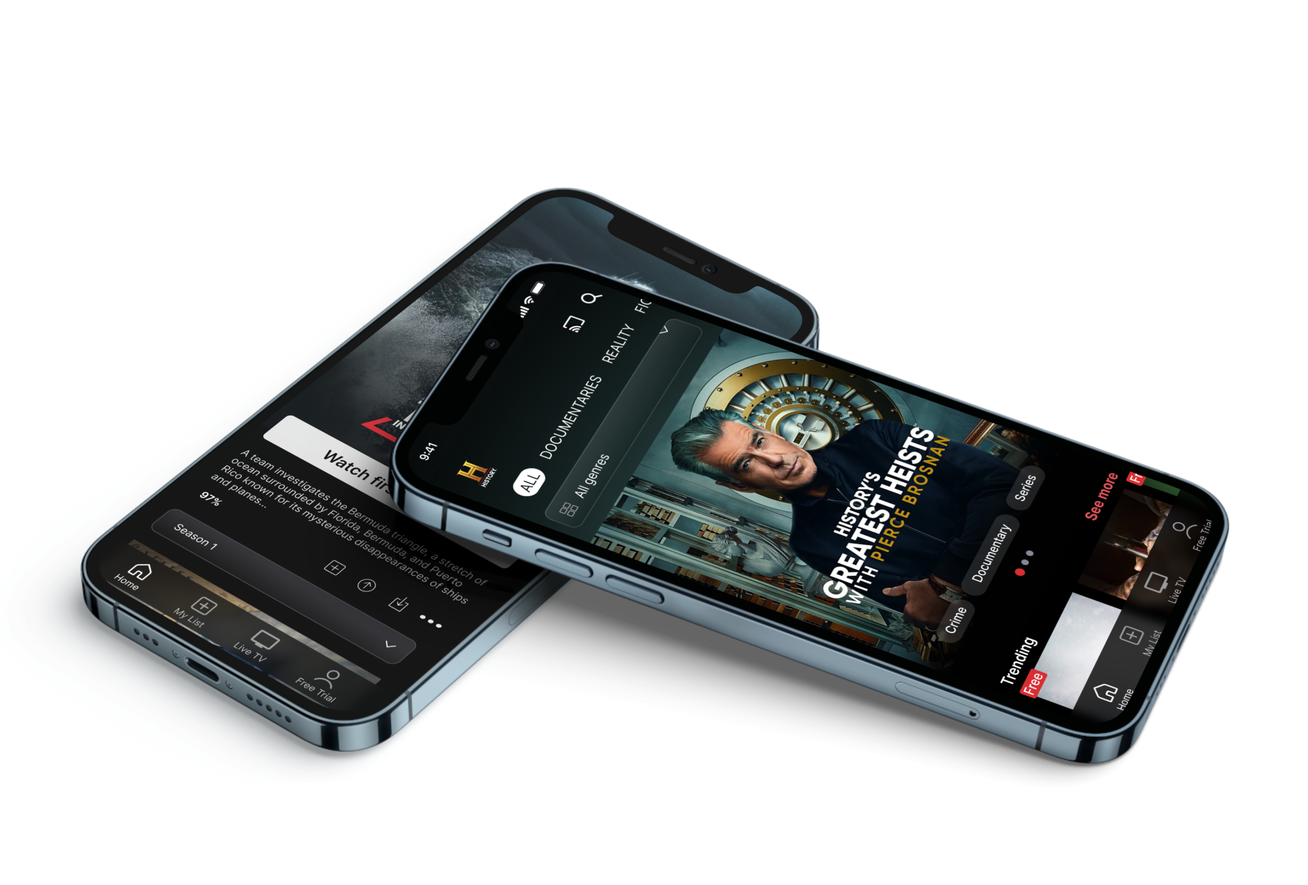
Before & After
Three screens redesigned in response to what users reported. Each one removes a barrier they described.
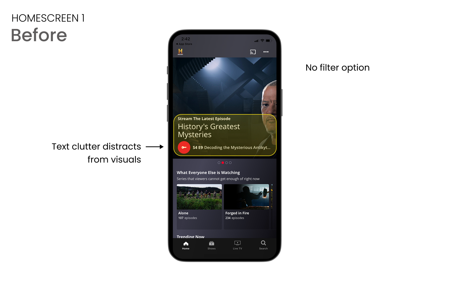
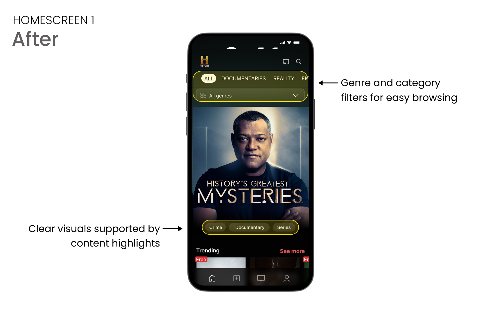
Surfacing content that was always there
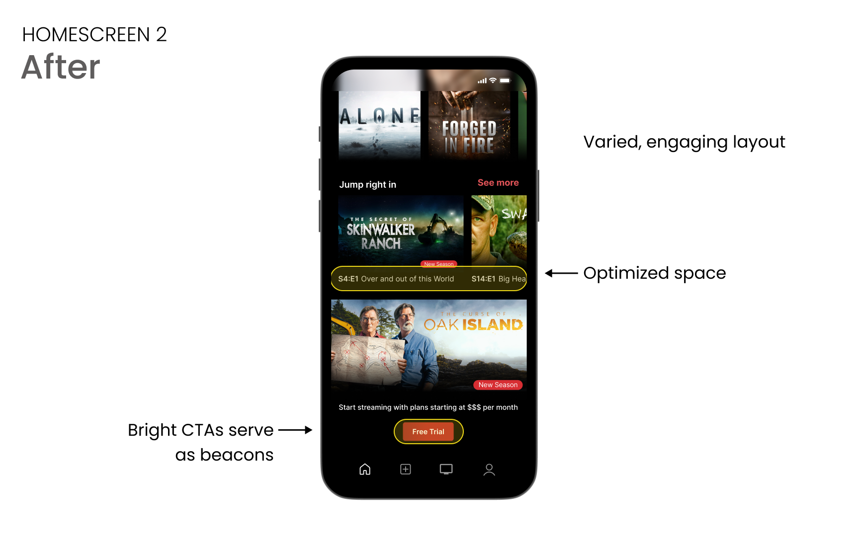
"I have to work harder than I'd expect to find what I want to watch." The original home screen was a full-width hero with no browse rows; if you didn't recognize the featured title, there was no path forward. The redesign adds categorical rows and genre filters.
The subscription ask, at the right moment
Reviews showed users questioning whether the app was worth paying for. The original free-trial CTA sat in the nav bar, disconnected from any decision. The redesign moves it inline on show pages, after the viewer has found something worth the money.
Sharing without leaving the show
Not from the reviews, but a gap the competitive audit surfaced: sharing required leaving the content entirely. The redesign puts it in the show card, one tap, no context switch.
Reflection
This was a self-directed redesign, so I don’t have live metrics, but the design decisions are built around the findings. Filters where they’re most needed. Artwork that leads instead of competes. A free-trial CTA positioned at the exact moment viewers decide. Each one is a hypothesis I’d want to test in production.