
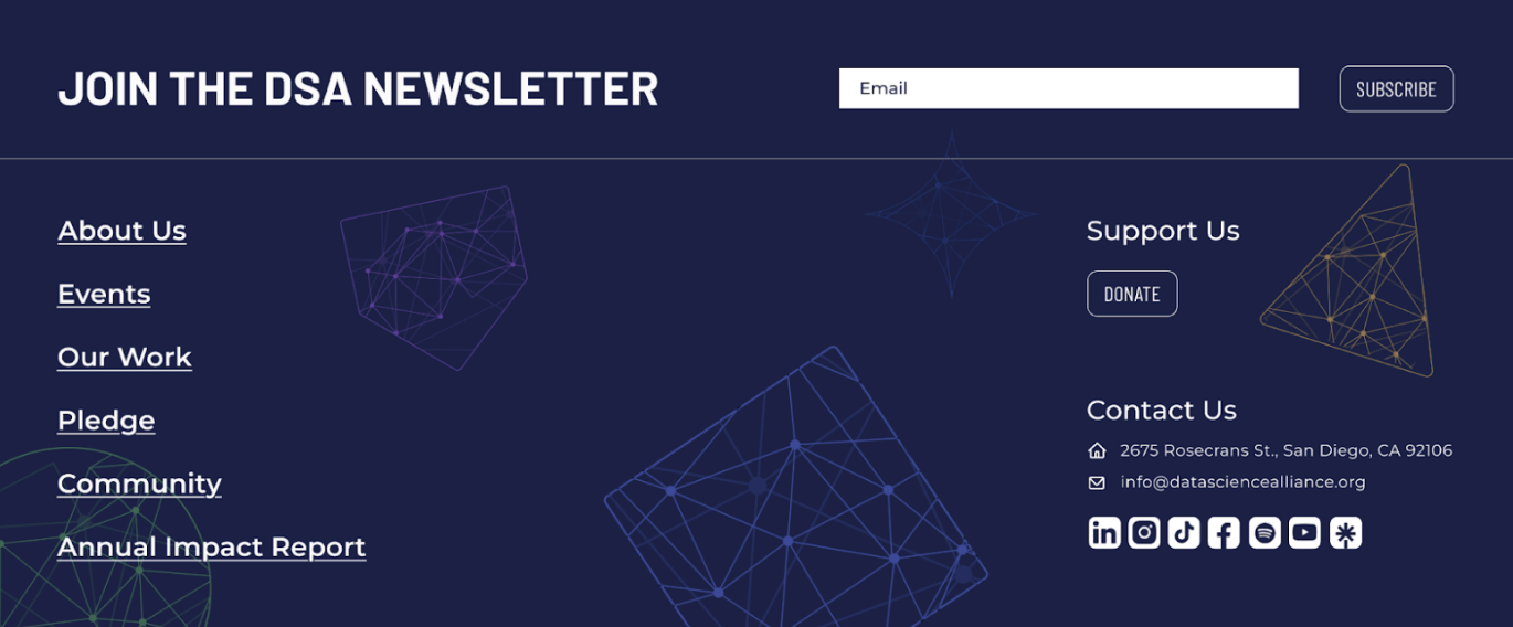
Footer Design to Drive Donations
• work project - 2025
Refined UI details, accessibility, and responsiveness to ensure a consistent final design across devices.
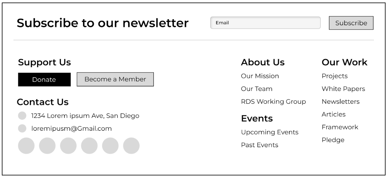
• Version 1
Grouped links into column categories faster scanning and better information hierarchy.
• Version 2
Elevated "Donate" and "Subscribe" as primary actions, bringing conversion touchpoints to the forefront.

• Version 3
Maintained brand alignment by integrating vector elements and color treatments consistent with the design system.
• Impact
Improved donation flow through clearer footer structure and CTAs. Now implemented on the live site.
.png)