Is it difficult for you to find a mentor?
.png)
What is your preferred method of networking
.png)
How do you prefer to learn new information?
“I like word-of-mouth because it’s basically an informal review system”
“I trust people when I can see their work history and organizations they are connected to”
“I trust people with similar backgrounds as me”
“I don’t like Linkedin because it is too saturated"
“Clients tend to cancel when there aren’t any repercussions”
“Networking on apps and websites isn’t organic enough”

"I want to connect with someone experienced who will help me break into my new career."

"I want to network and find a community of people who are also passionate about the field I work in."
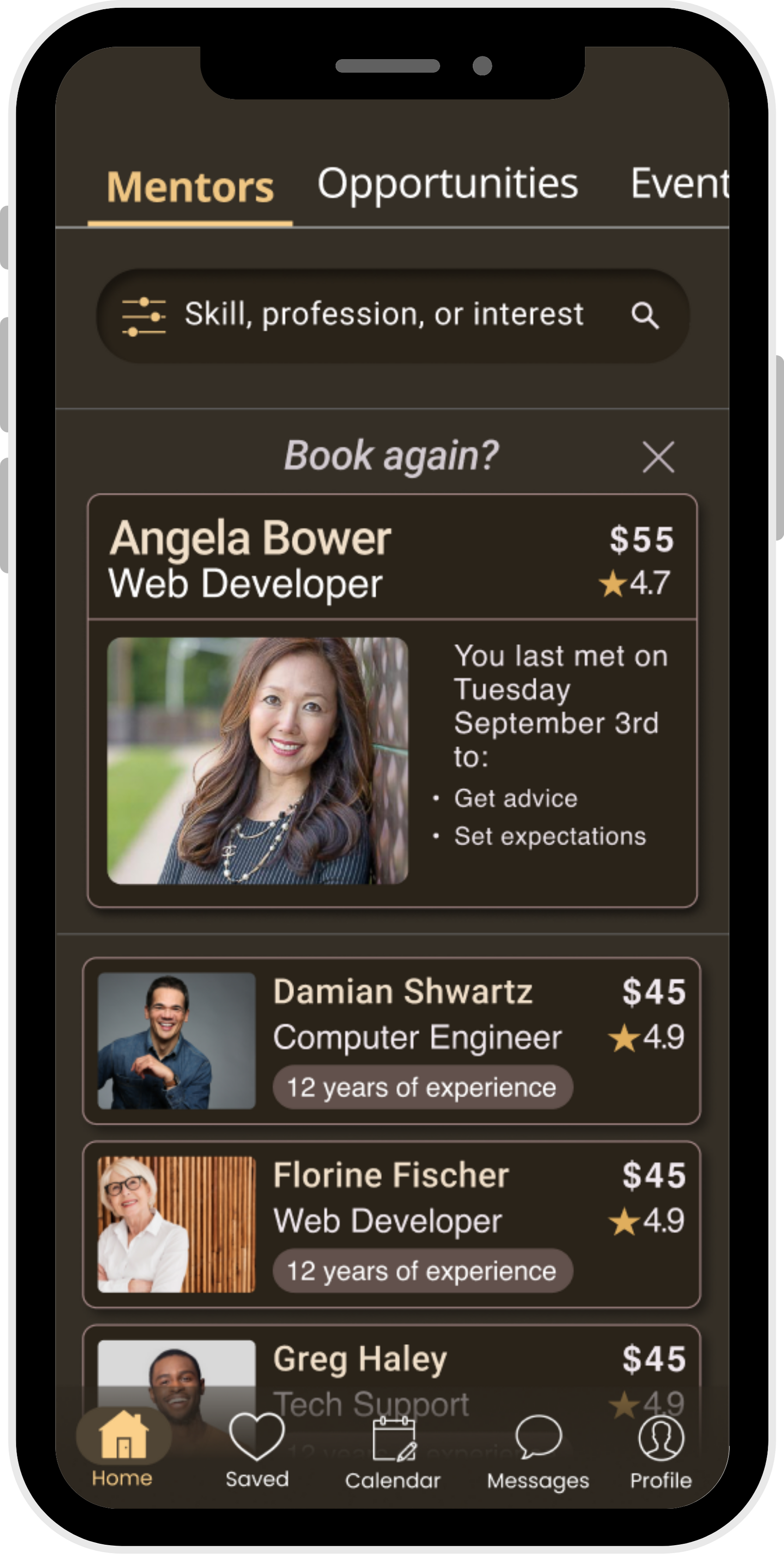
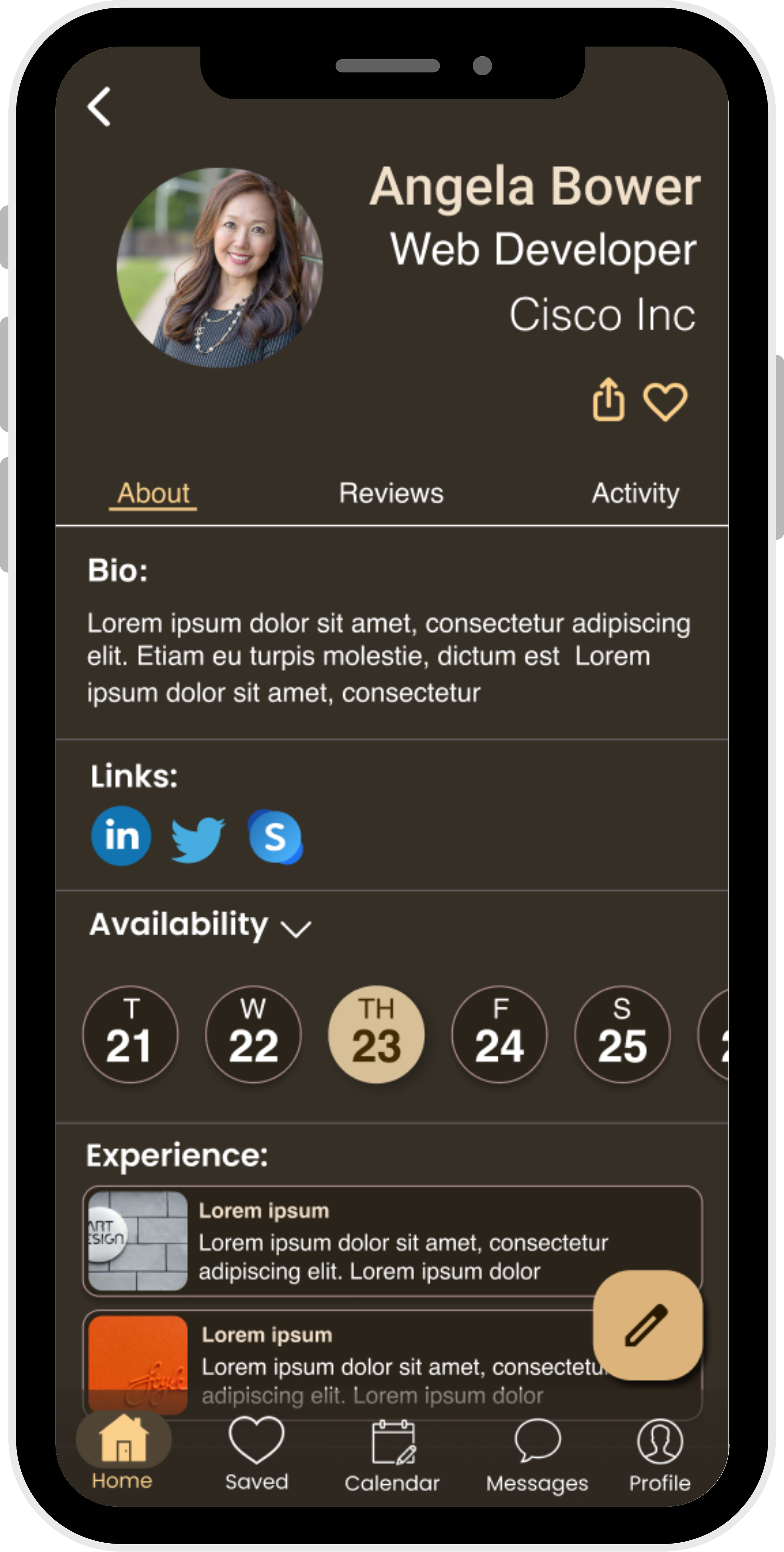
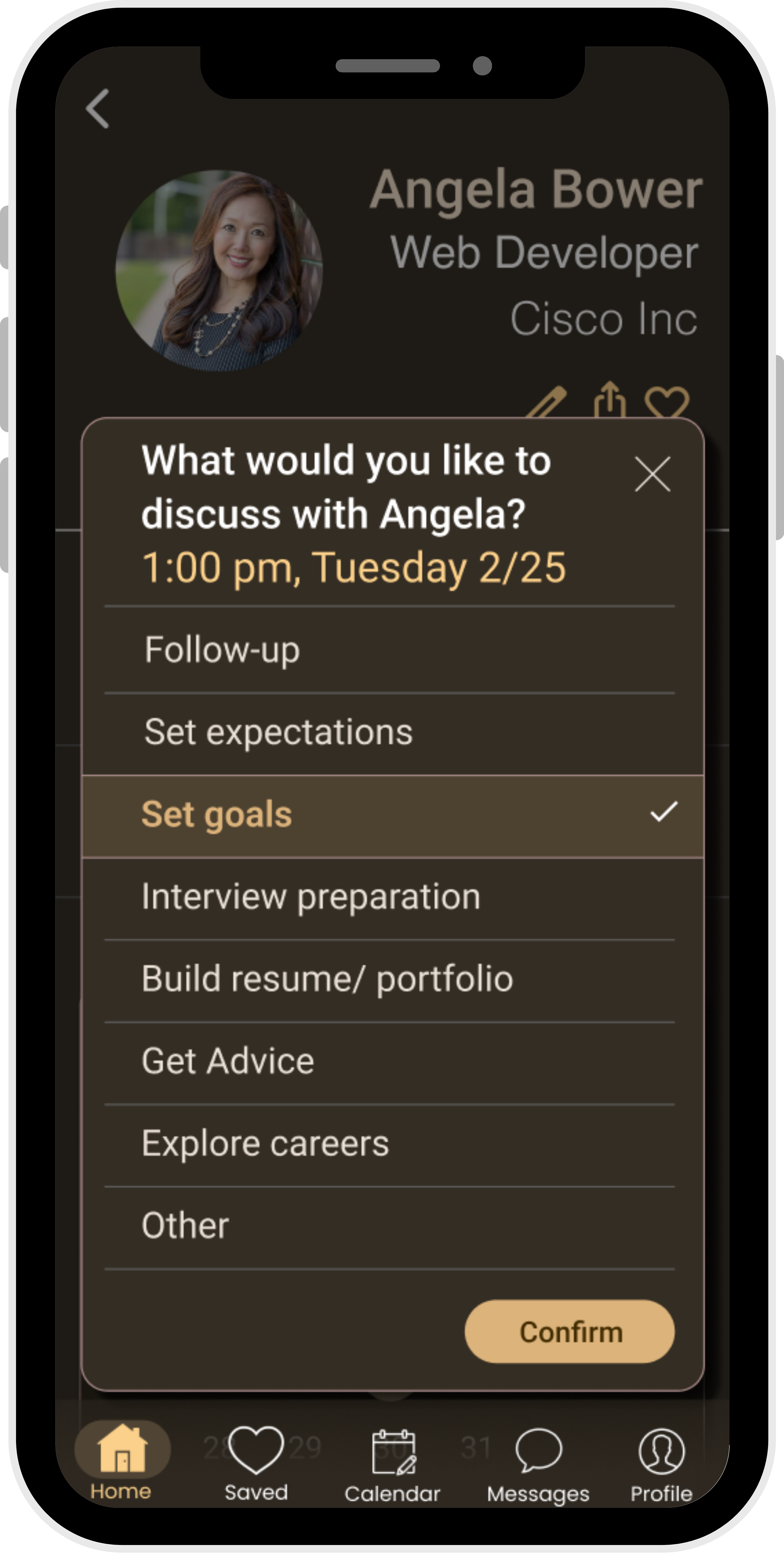
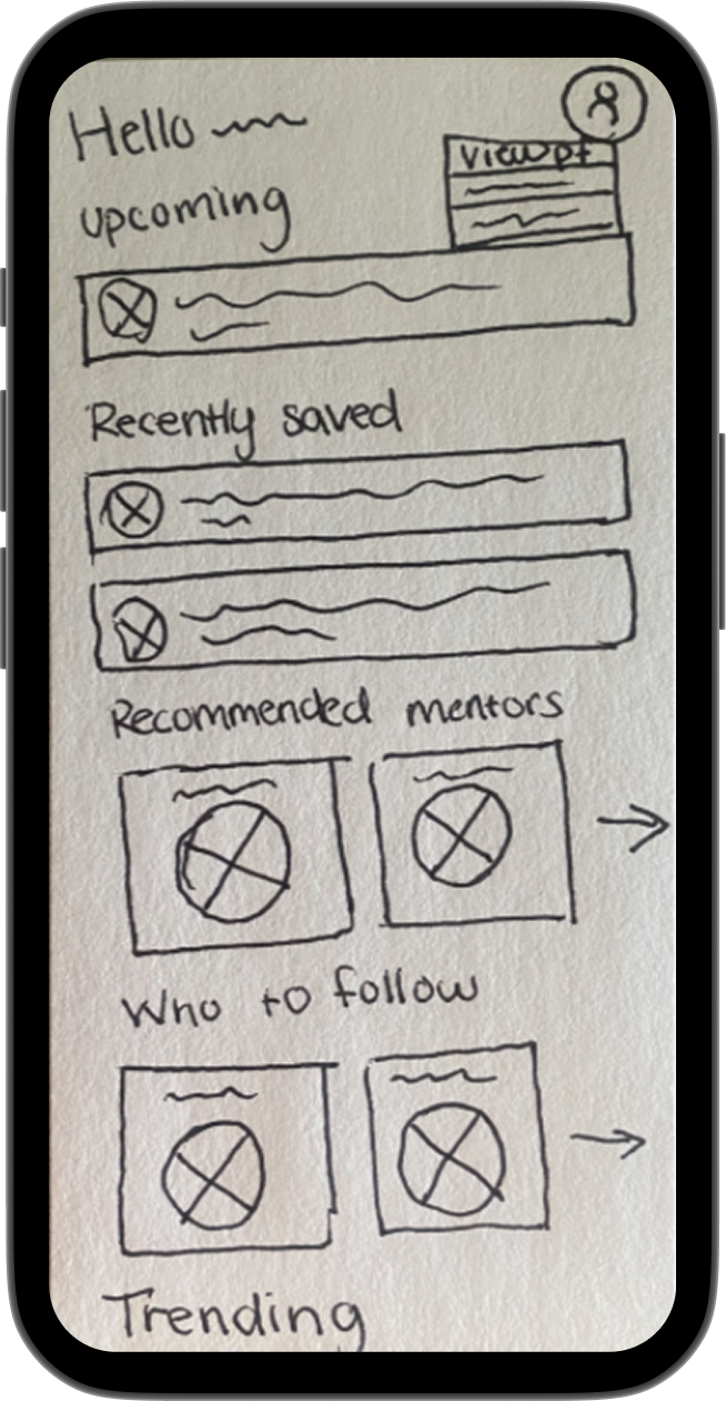
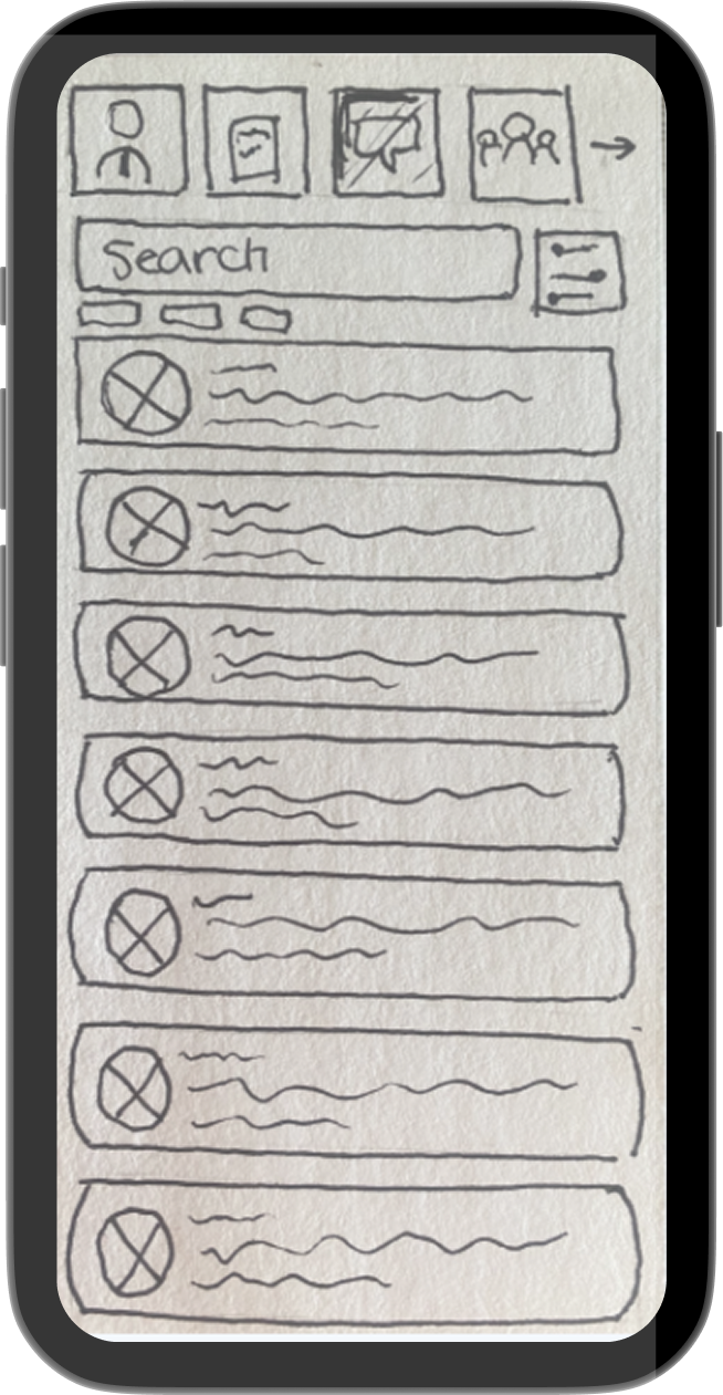
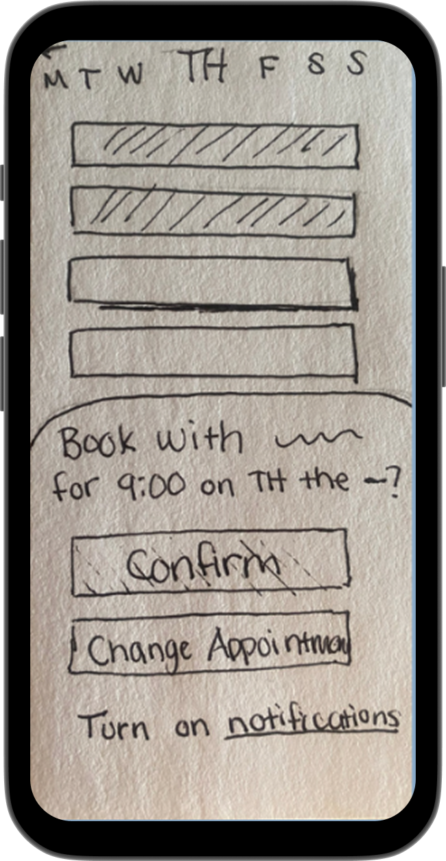
Flow 1: Schedule an appointment
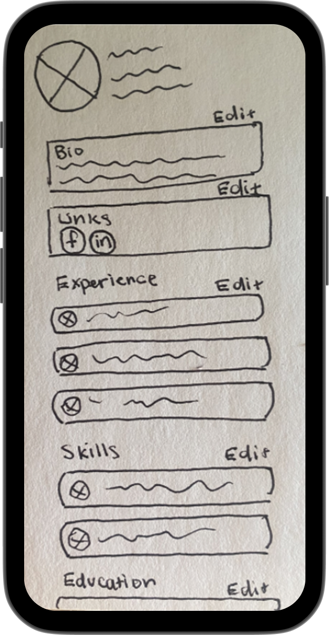
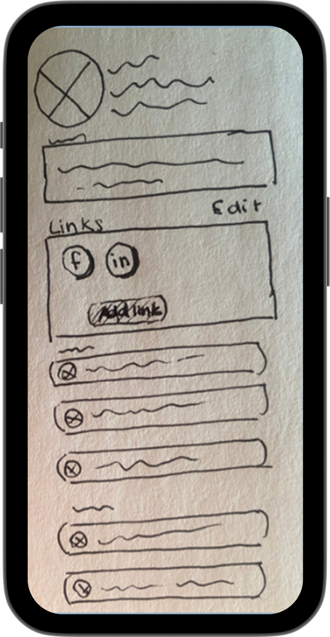
Flow 2: Attach a link to profile
During testing I observed participants complete a series of tasks to uncover strengths and friction points, which led to identifying the most severe issues and their solutions.
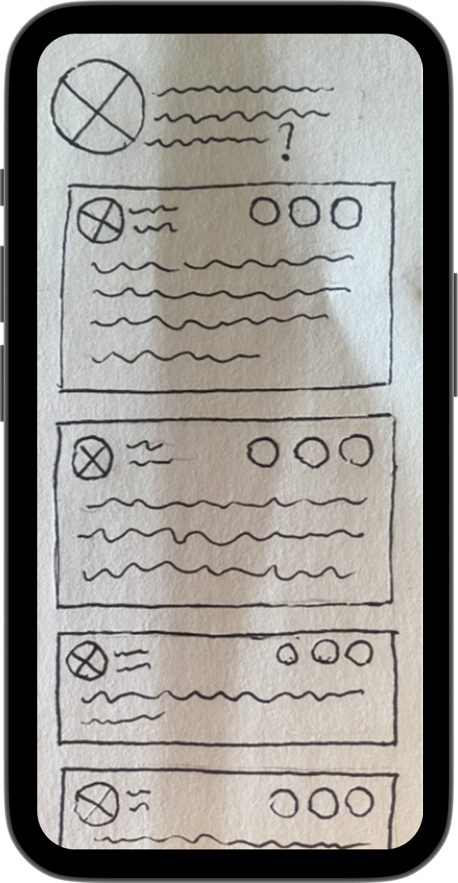
Issue 1
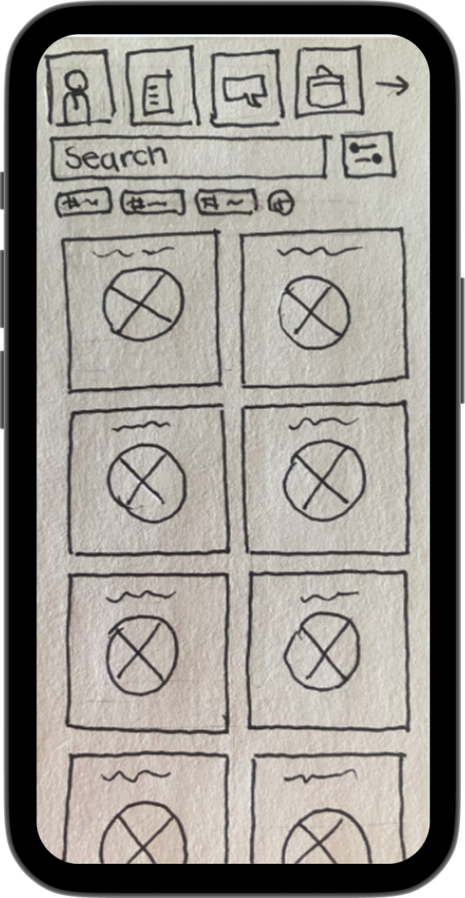
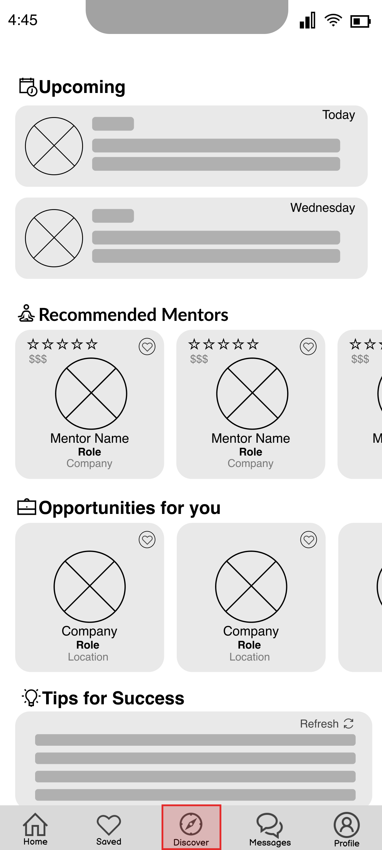
Participants couldn’t find the discussion post.
Solution
Merged the discover page and the home screen to remove extra steps, as discovery is the main purpose of the app.
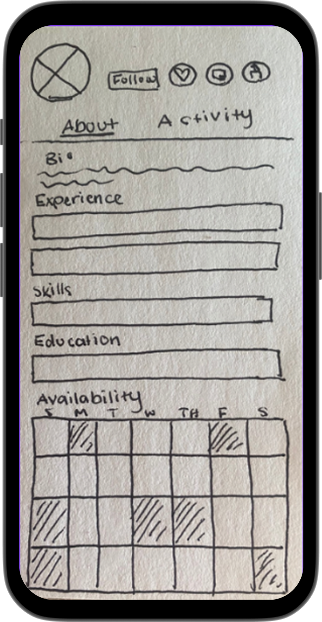
Issue 2
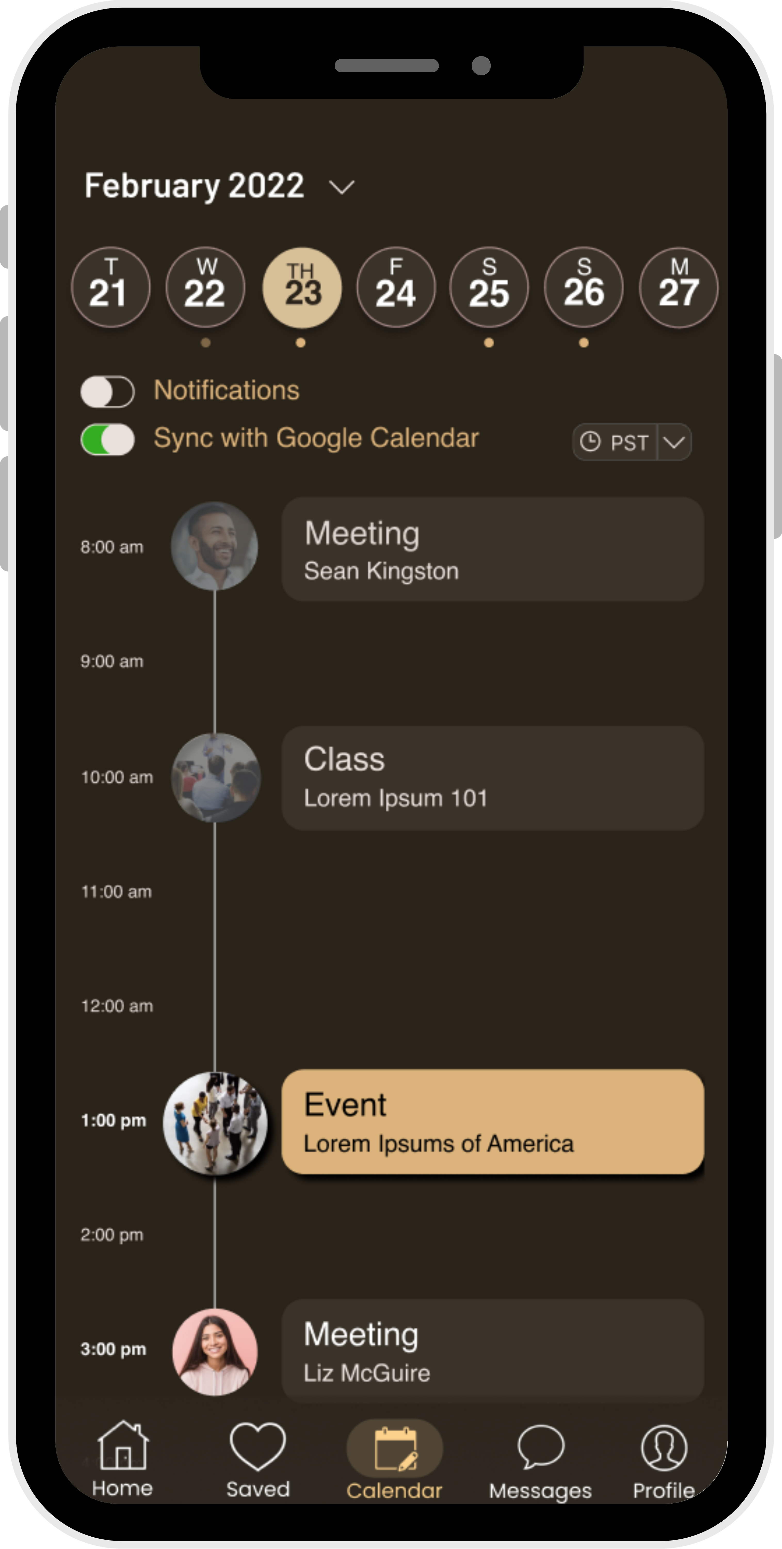
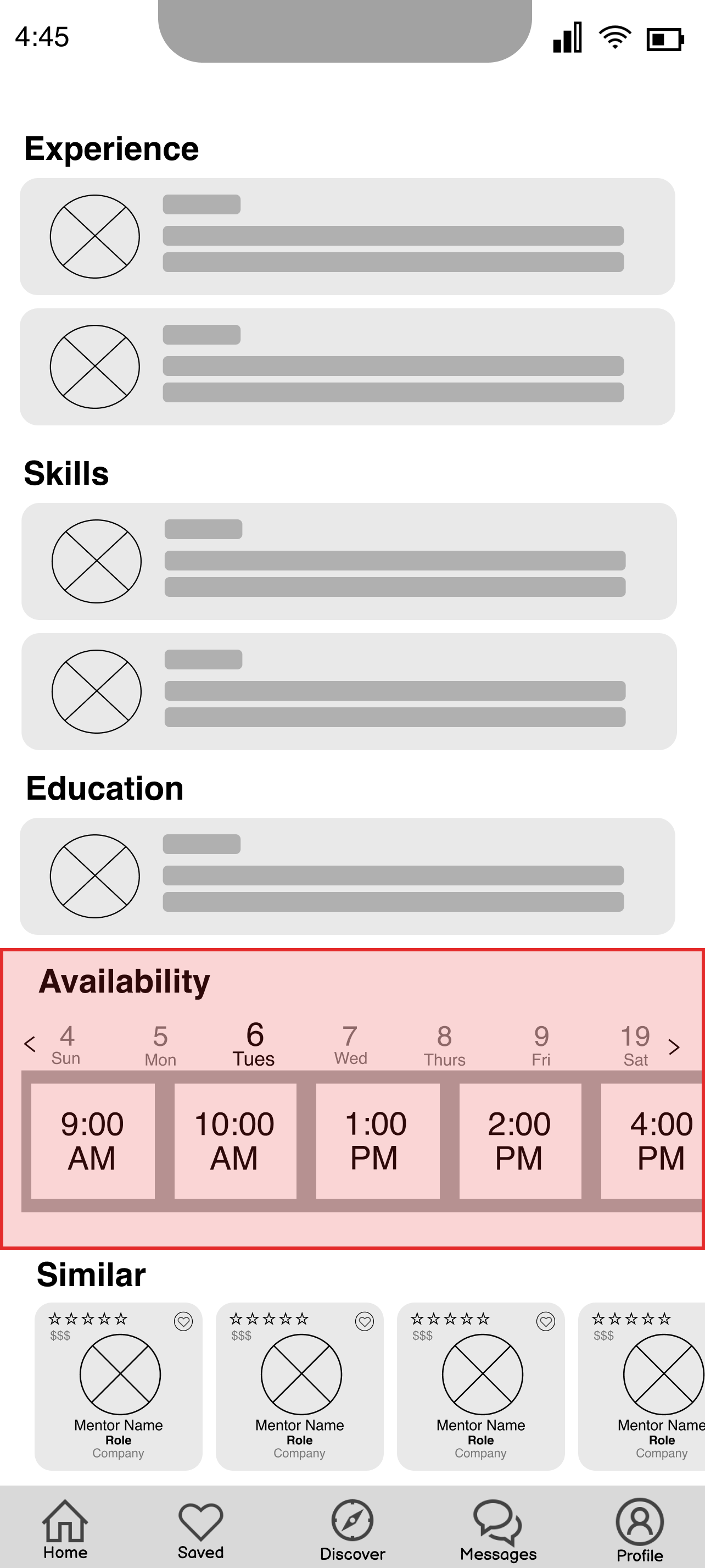
Participants couldn’t find or use the appointment feature.
Solution
Moved mentor availability to the top and added a calendar to simplify scheduling.
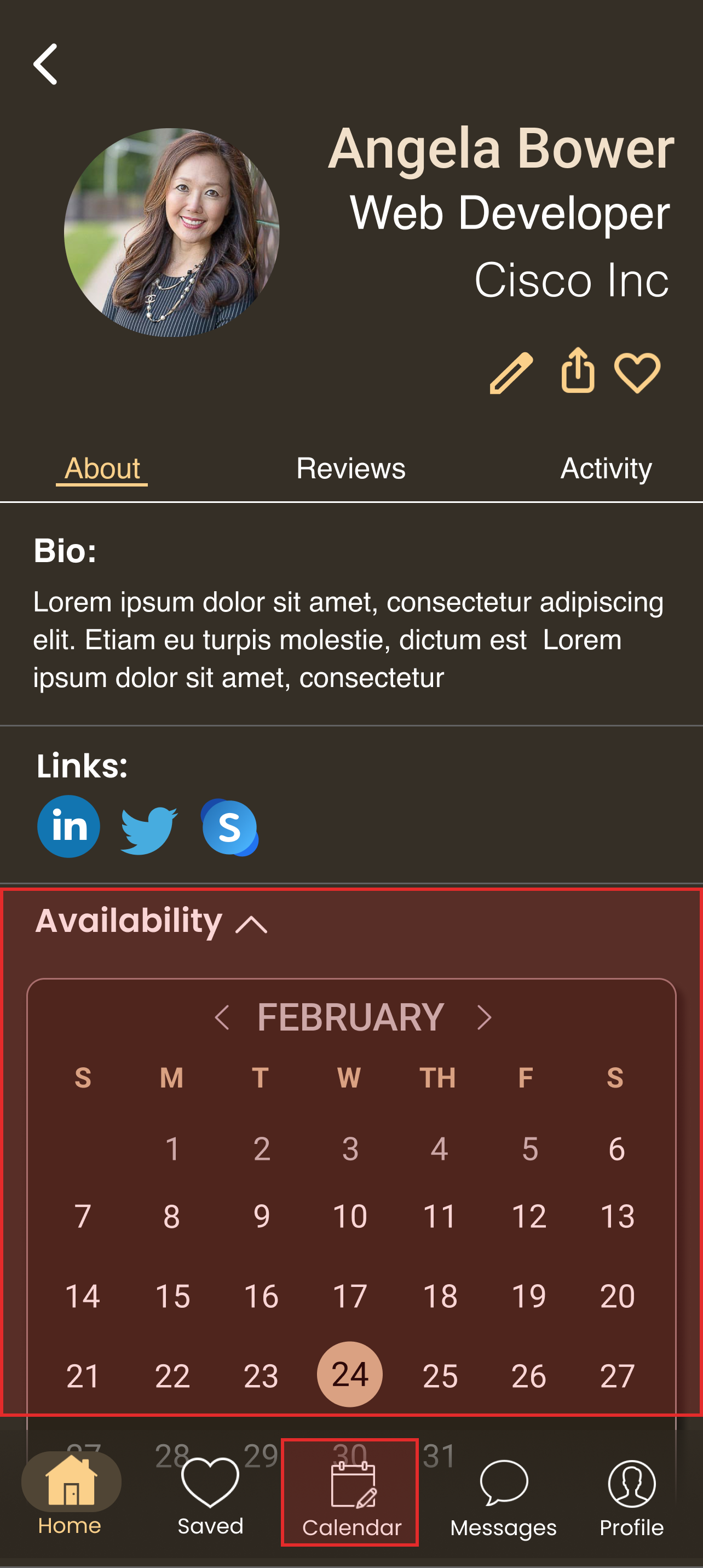
After receiving feedback, I refined the layout by enhancing contrast, adding borders, and increasing whitespace, resulting in a final Career Guru design that balances accessibility with visual appeal.
.png)

.png)
.png)
.png)