


An AI shopping tool that knows the store as well as the list.
Problem
A quick grocery run usually involves an invisible mental overhead. Remembering everything, choosing the right store, then navigating a list that doesn't consider the context of the store and the shopper.
Discover
Research revealed that users want tools that match real shopping
Fourteen grocery app users ranked discoverability and list management far ahead of personalization. That decided what stayed and what got cut from v1.
Three themes emerged across conversations with regular grocery shoppers.
"I rearrange the list in my head as I walk through. Every time. It's just something I've accepted."
On store variability"I'm already making a hundred small decisions in there. The last thing I want is to figure out an app on top of it."
ON MENTAL LOADI shop at two or three different stores depending on the week. I basically have a different mental map for each one.
ON PLANNINGOpportunities
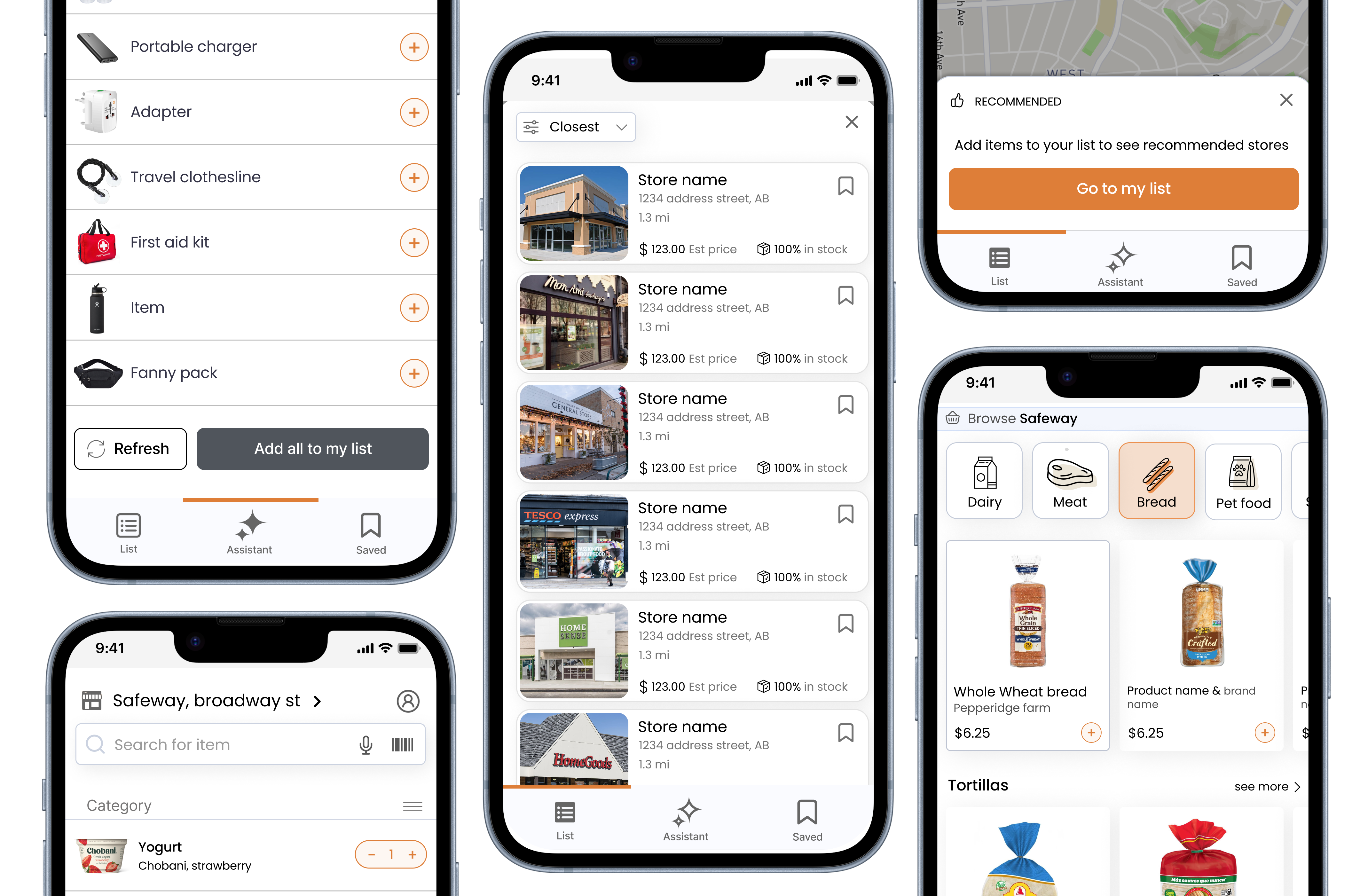
Reorder the list automatically based on the store layout, so the shopper follows one path instead of backtracking.
Shoppers are tired and in a hurry. Adding items should take one tap, not a form. Voice, recents, and smart suggestions reduce the cost of keeping the list current.
If you shop at multiple stores, the app should know that Trader Joe's and Safeway have different layouts and different items, and adapt without you having to manage it.
Prototypes
Three screens, each covering a distinct moment of friction: arriving at a new store, routing through it efficiently, and getting help mid-trip without losing your place.
Reflection